

The Challenge
Project Prompt: Redesign a nonprofit website
The IOU Foundation is an Austin-based local charitable organization whose fundraising and volunteer efforts support a multitude of large and local charities. However, the current design of the foundation website is outdated, not responsive, and hard to navigate. This leaves current users unable to find the information they need to contribute to the foundation and hesitant to donate through a site they don't completely trust.
A redesign of the site is necessary to enable and encourage people to support their community by contributing to the foundation.
We set out to refresh, reorganize, and redesign the IOU Foundation's website with the goal of creating a responsive and usable site that enables users to find exactly what they need to contribute to the foundation along with fostering an atmosphere of trust and community kinship that encourages users to become a part of the IOU Foundation family.
My Role
Designer & Project Manager
I led the team as Project Manager, leading standups and prioritizing tasks in Kanban boards. As a designer, I collaboratively contributed to every stage of the design process, taking the lead in early research synthesis and definition as well as in the creation and implementation of a style guide for our hi-fi prototype.
The Team
6 Designers
Tools
Figma, Figjam, Google Suite, Otter.ai
Timeline
3 weeks
The Solution
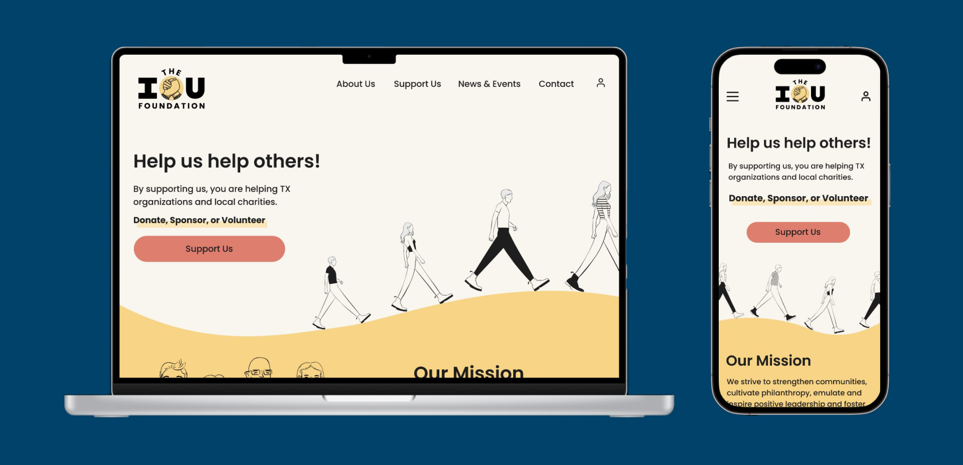
Our proposed solution is a responsive redesign of the IOU Foundation's website featuring a concise site structure and navigation, a more friendly design system of warm colors and welcoming illustrations, and a responsive and usable mobile site design.
We found that twice as many users were able to identify the core mission of the foundation and locate the upcoming events in our usability testing for our final redesign compared to our testing of the original site. We also found that approximately 10% more users were able to easily locate where to donate in our redesign compared to the original site.
This increase in usability of core functions of the foundation site illustrates the value a redesign would bring to the IOU Foundation in the form of more potential donations and volunteers.
Mobile Prototype Walk-through
Desktop Prototype Walk-through
The Story
Where it all began...
Why IOU?
The obvious first step for this project was to choose a nonprofit website to redesign.
From the organizations provided, we chose The IOU Foundation for the variety of local charities they support, the dedication of their 100% volunteer team, and their unique BBQ fundraising efforts. Our team really related to the foundation’s values and community efforts, and we also felt that we could make a difference for the foundation by redesigning their website.
The Original IOU
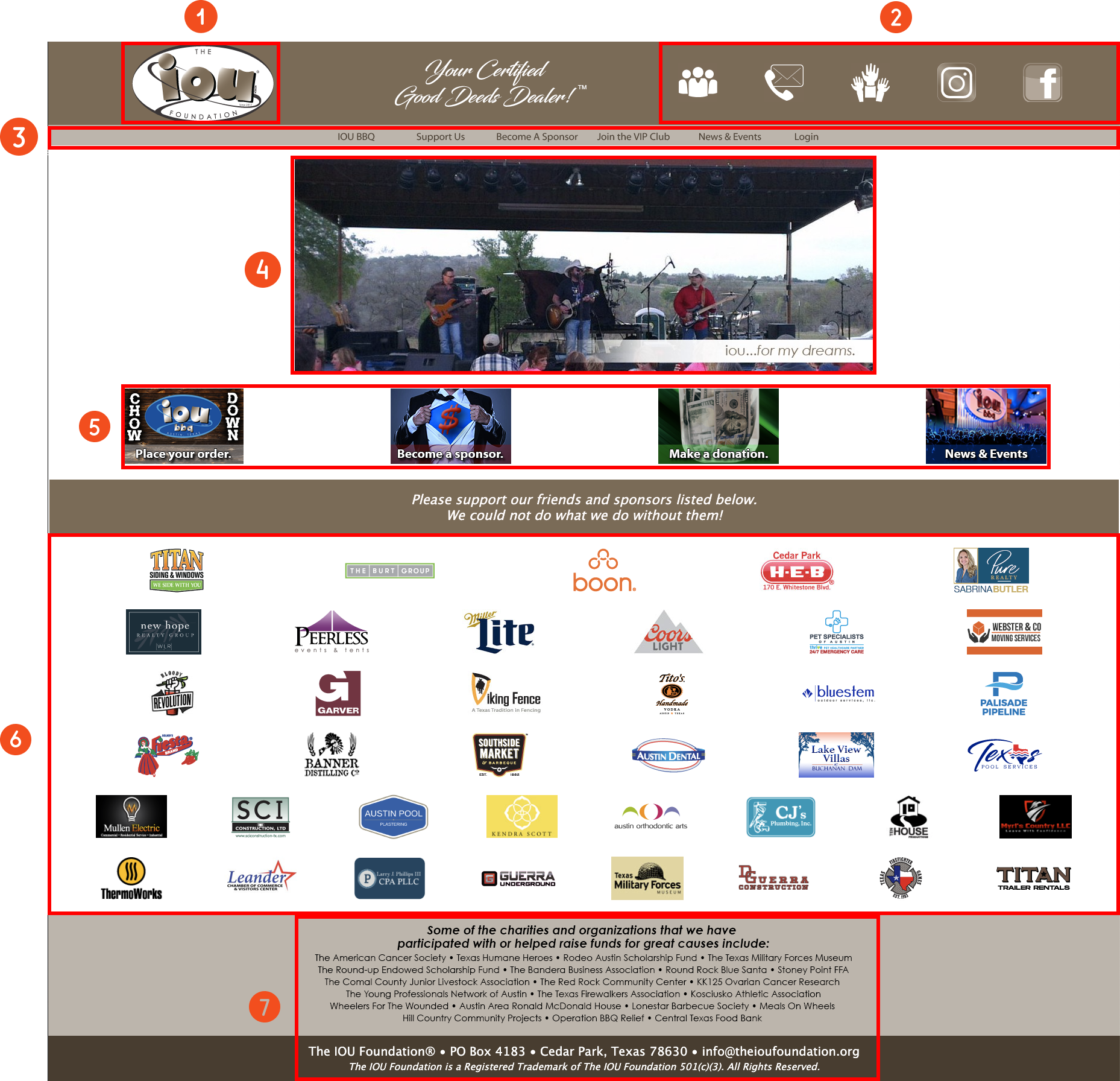
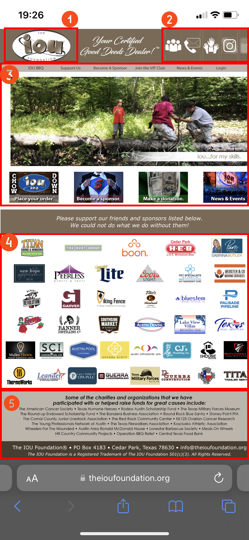
My first impression of the IOU Foundation's website was that it seemed confusing and outdated.
We identified three main areas of improvement in our initial heuristic evaluations:
1. Confusing Navigation
There are three main nav bars on the site - a top bar of icons (2), a main nav bar just above the hero space (3), and a row of image style buttons in the hero space (5).
The top icons (2) are not universal and lack labels, so it can be hard for users to identify what they're for. The hero image buttons (5) are unnecessary repeats of the main navigation bar found just above them.
2. Poor Layout & Outdated Aesthetic
The current design of the site is outdated and poorly spaced, lacks effective hierarchy, and does not reflect the foundation and the welcoming atmosphere and community kinship it is meant to embody.
3. Not Responsive
The current site is not responsive and appears as a shrunken version of the desktop site when opened on mobile. This is especially a problem in our main-mobile world, as many prefer the convenience of mobile donations over other methods of giving.
Discovery
We started our research with 2 user interviews/usability tests of the original site each, totaling 12 interviews/tests. I also contributed to an initial survey to get some additional quantitative data from users to inform our redesign.
From our research, we created...
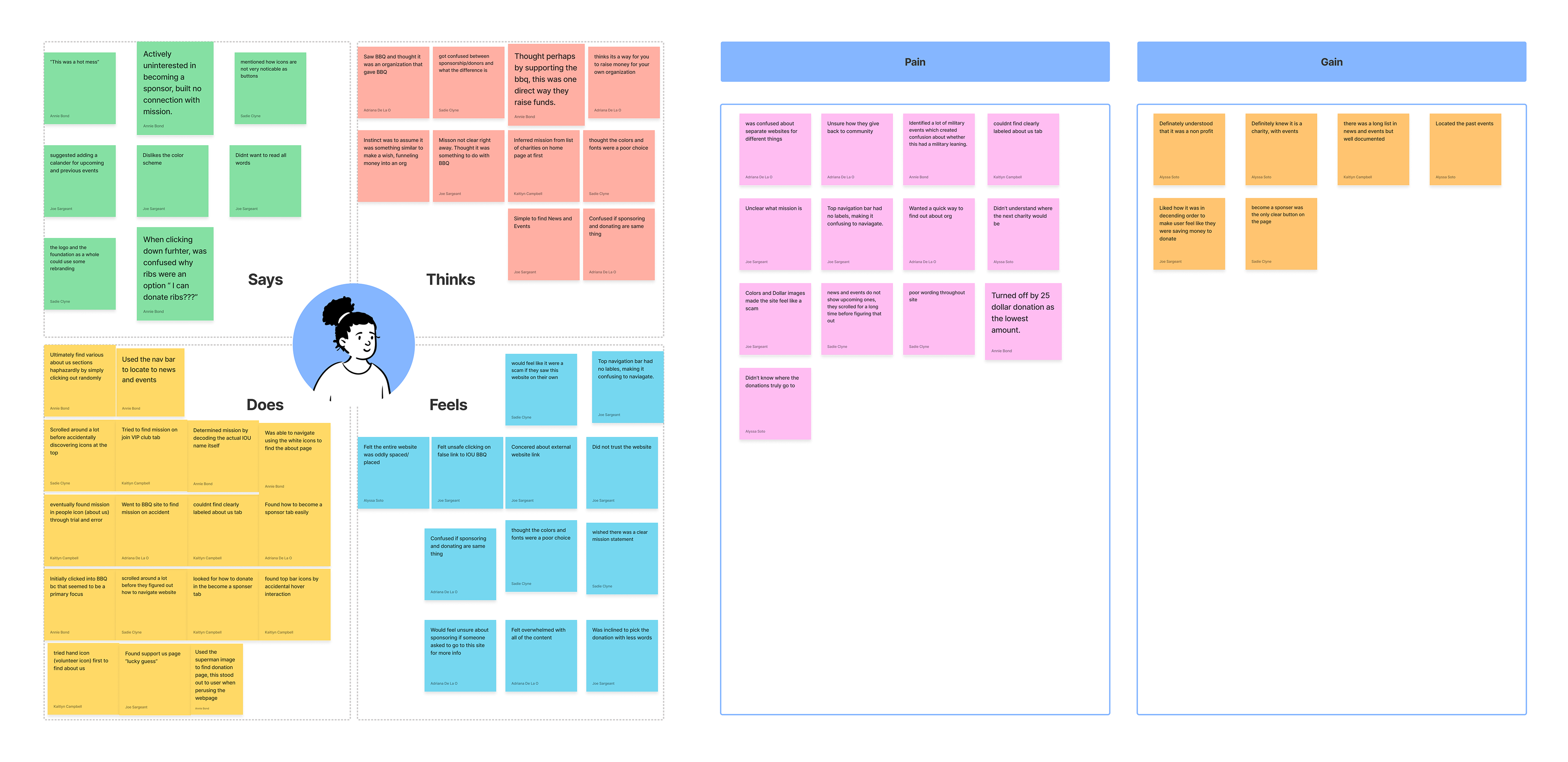
- an affinity diagram
- an empathy map
- two user personas
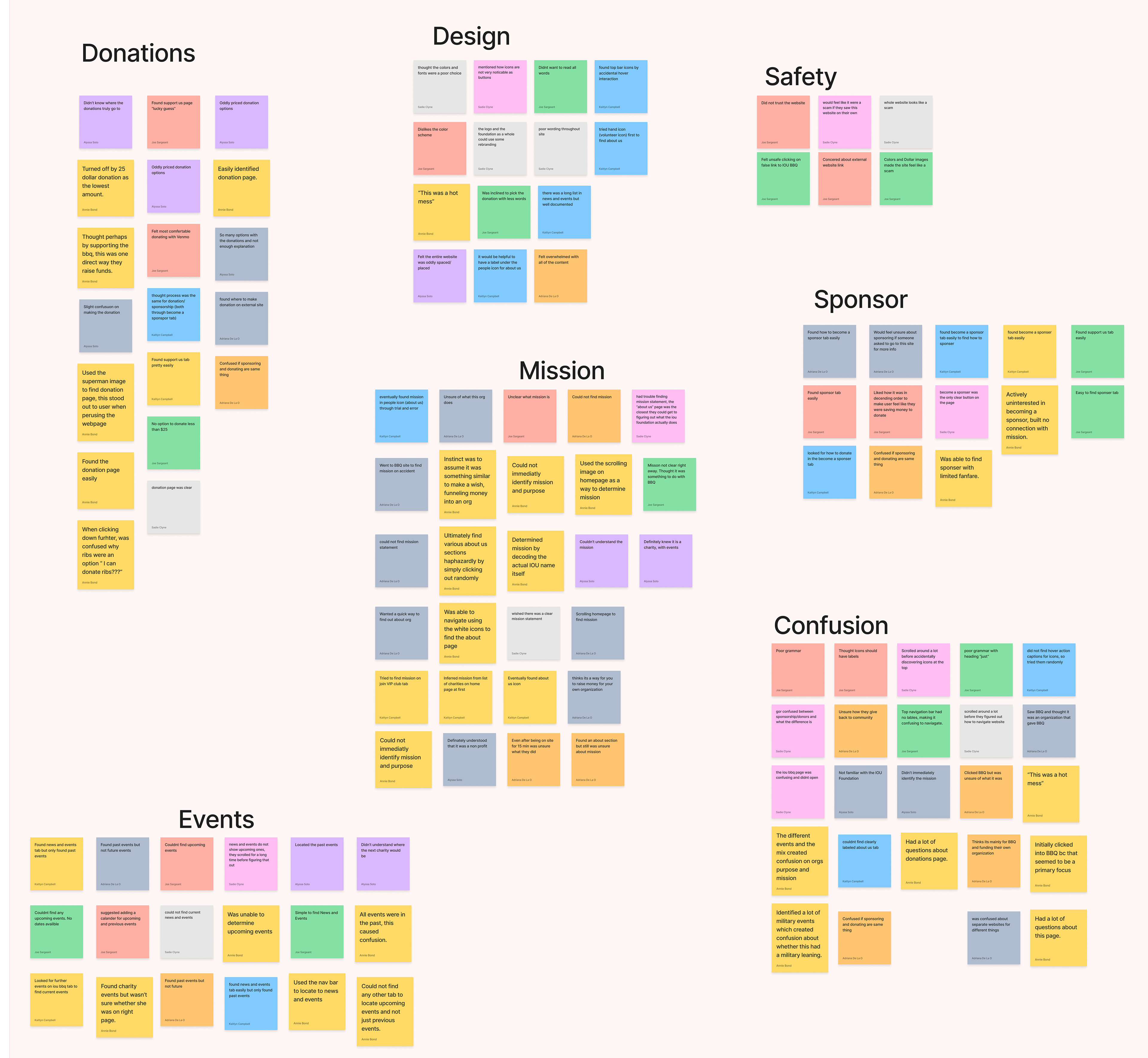
Affinity Diagram
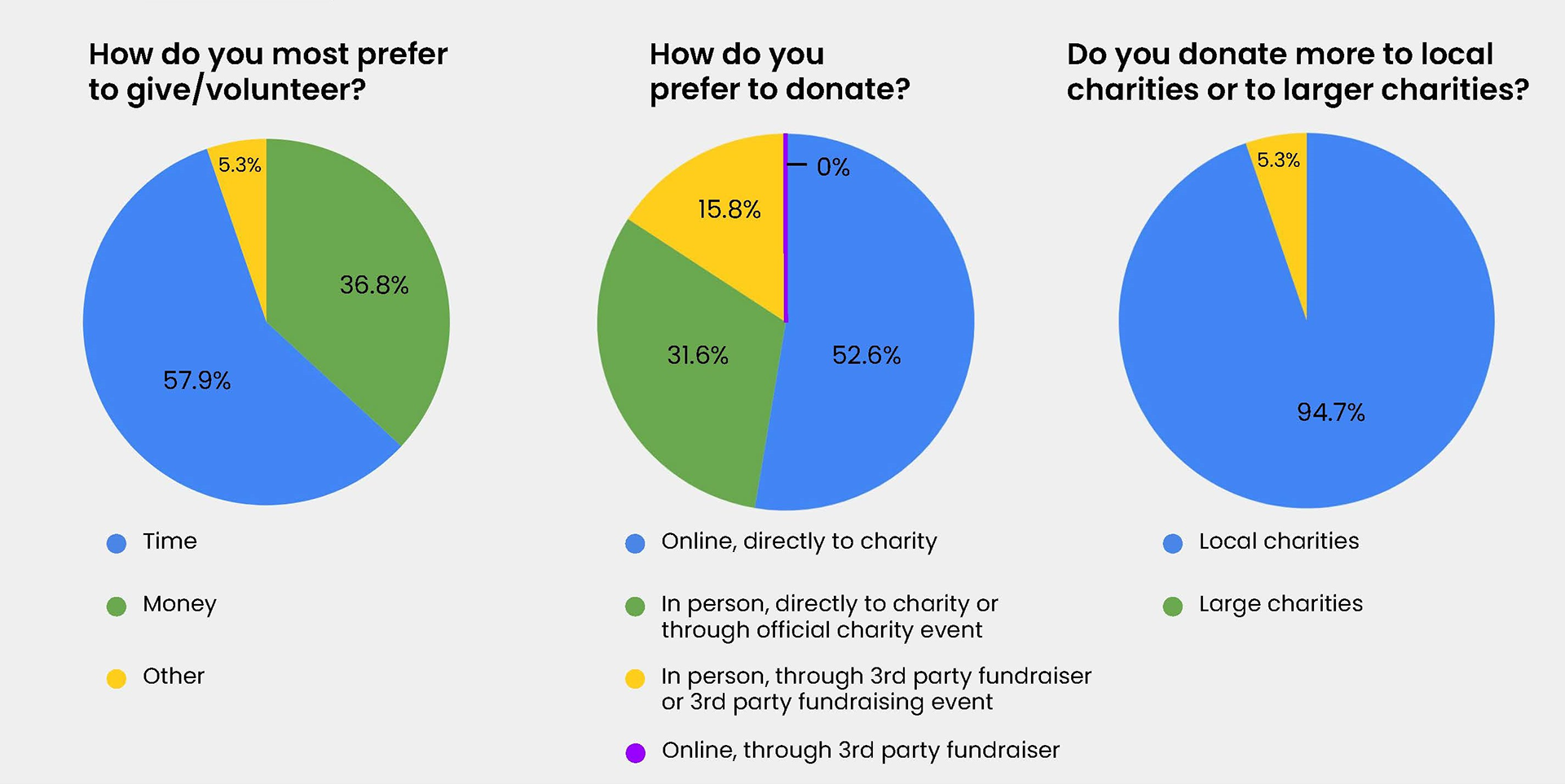
Survey Results
Empathy Map
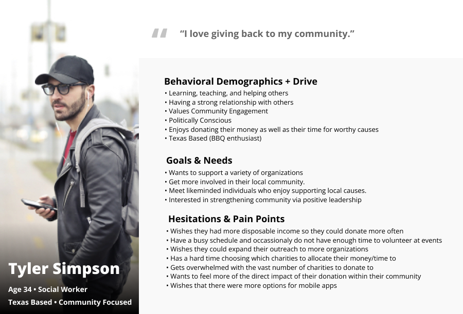
User Persona - Tyler, a donor & volunteer

User Persona - Sarah, a business owner & sponsor
From our research, we gleaned insights from both of our user sets.
Tyler, a donor and volunteer, needs to quickly understand how to navigate the website in order to easily donate their time and/or money while feeling secure about their online transaction.
Sarah, a business owner and sponsor, needs to understand and find value alignment in the mission statement in order to build a meaningful connection with IOU for the purpose of sponsorship opportunities.
The Problem Statement
The IOU Foundation utilizes their volunteer team, sponsors, and event coordination to raise money for charity. The website’s intention is positive and encourages good deeds but its lack of intuitive visual design and navigation makes it difficult for Tyler and Sarah to understand their mission, donation processes, and fundraising events.
How might we create trustworthy online donation/sponsorship processes to encourage users like Tyler and Sarah to support the foundation?
Our Hypothesis
By creating trustworthy online donation/sponsorship processes through designing a more professional and secure web presence, we can encourage users like Tyler and Sarah to support the foundation.
Design
After thorough research & definition, we moved on to ideation and information architecture. We decided to delegate parts of this phase to quickly cover more ground, so my part of this phase falls primarily in the information architecture section.
For my part of ideation & information architecture, I contributed to...
- a card sort
- a site map
- a user flow
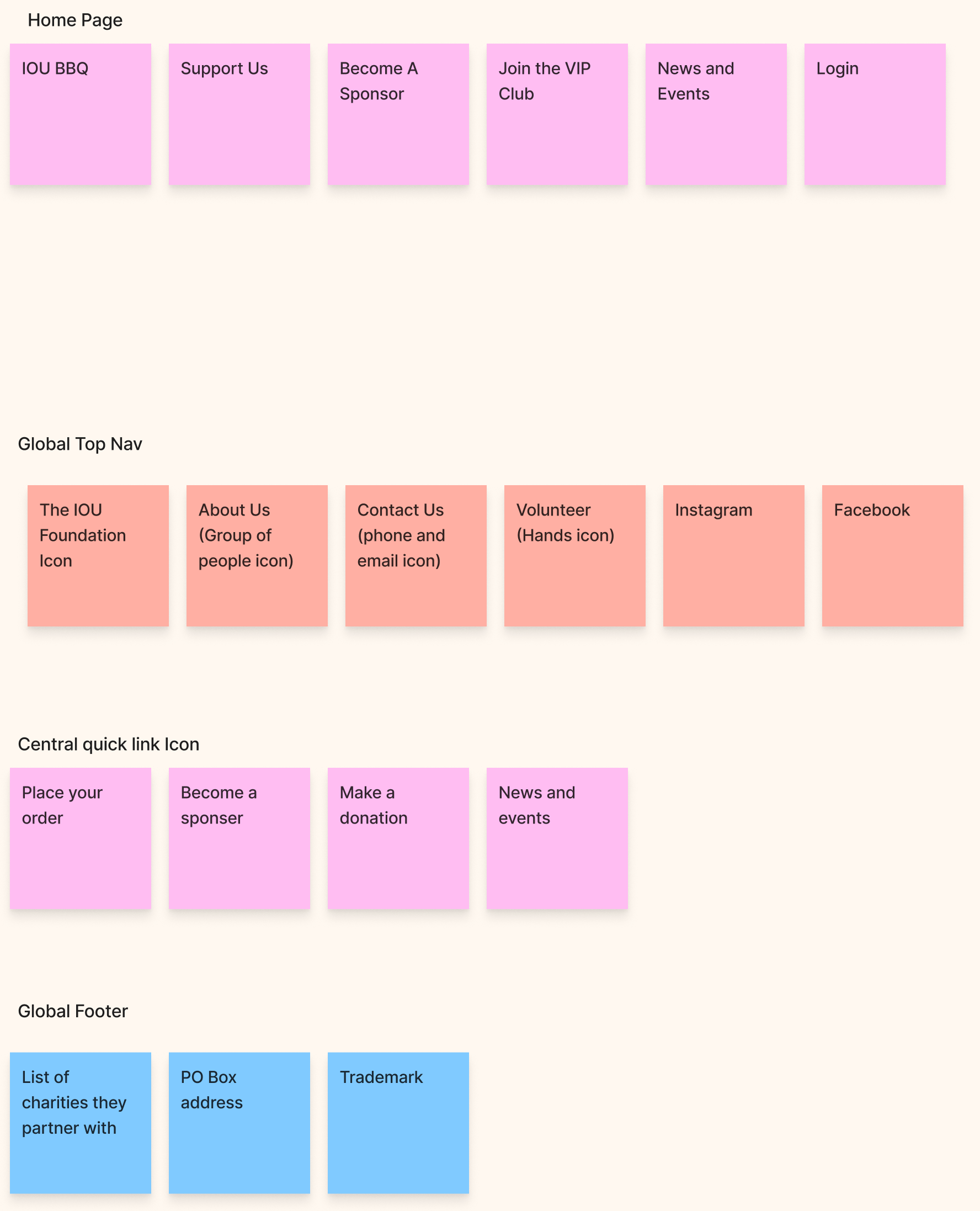
Content Inventory
Card Sort Results

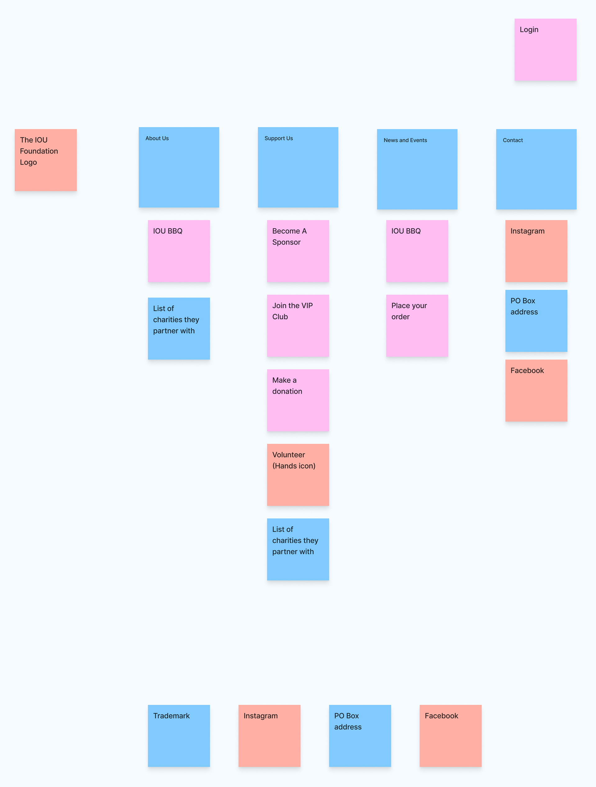
Site Map

User Flow
Prototype & Test
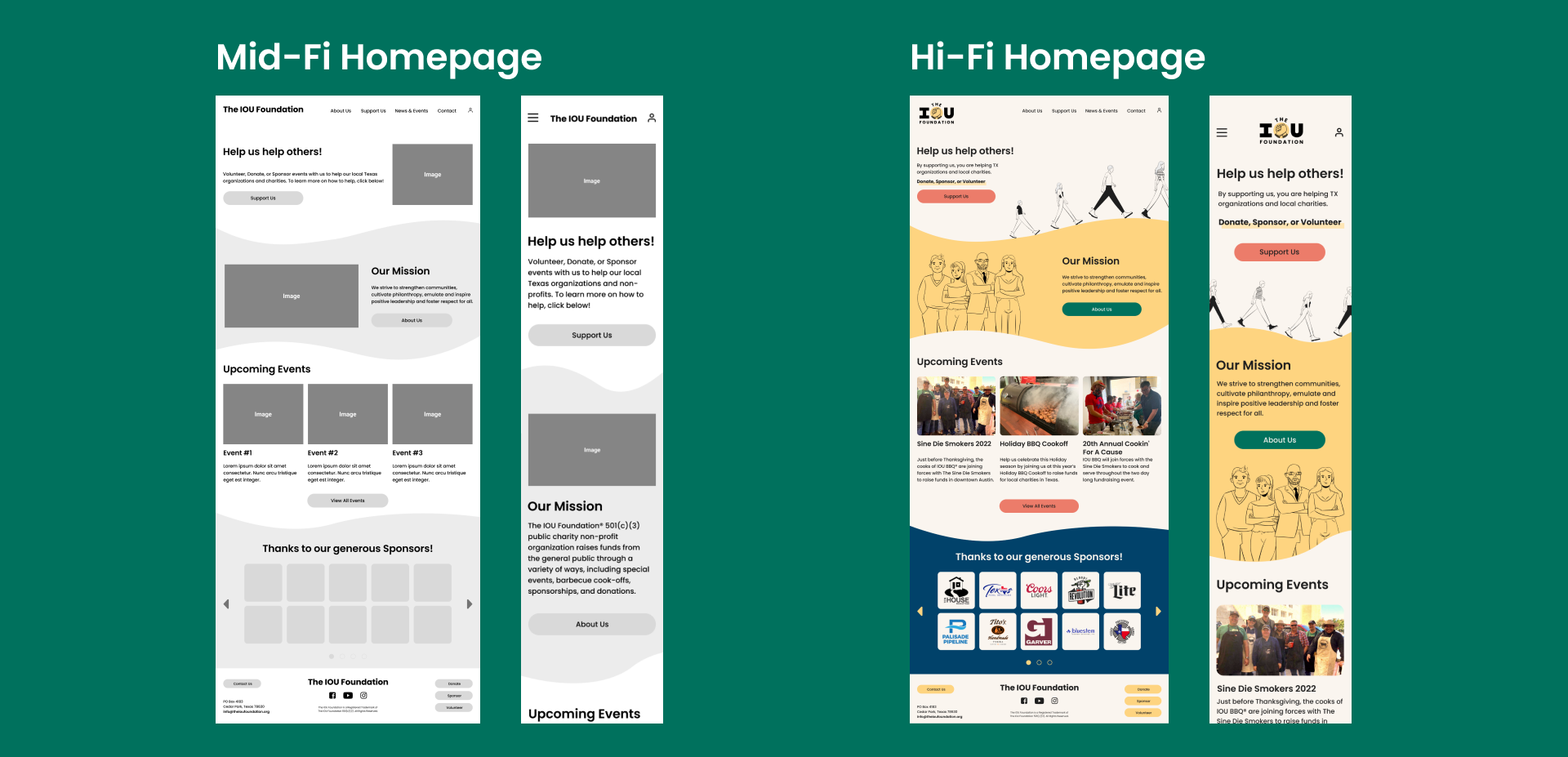
After ideation and information architecture, we proceeded to prototyping in low, mid, and high fidelity and testing in each phase. We also defined a style tile and style guide.
My main areas of contribution to this design phase are...
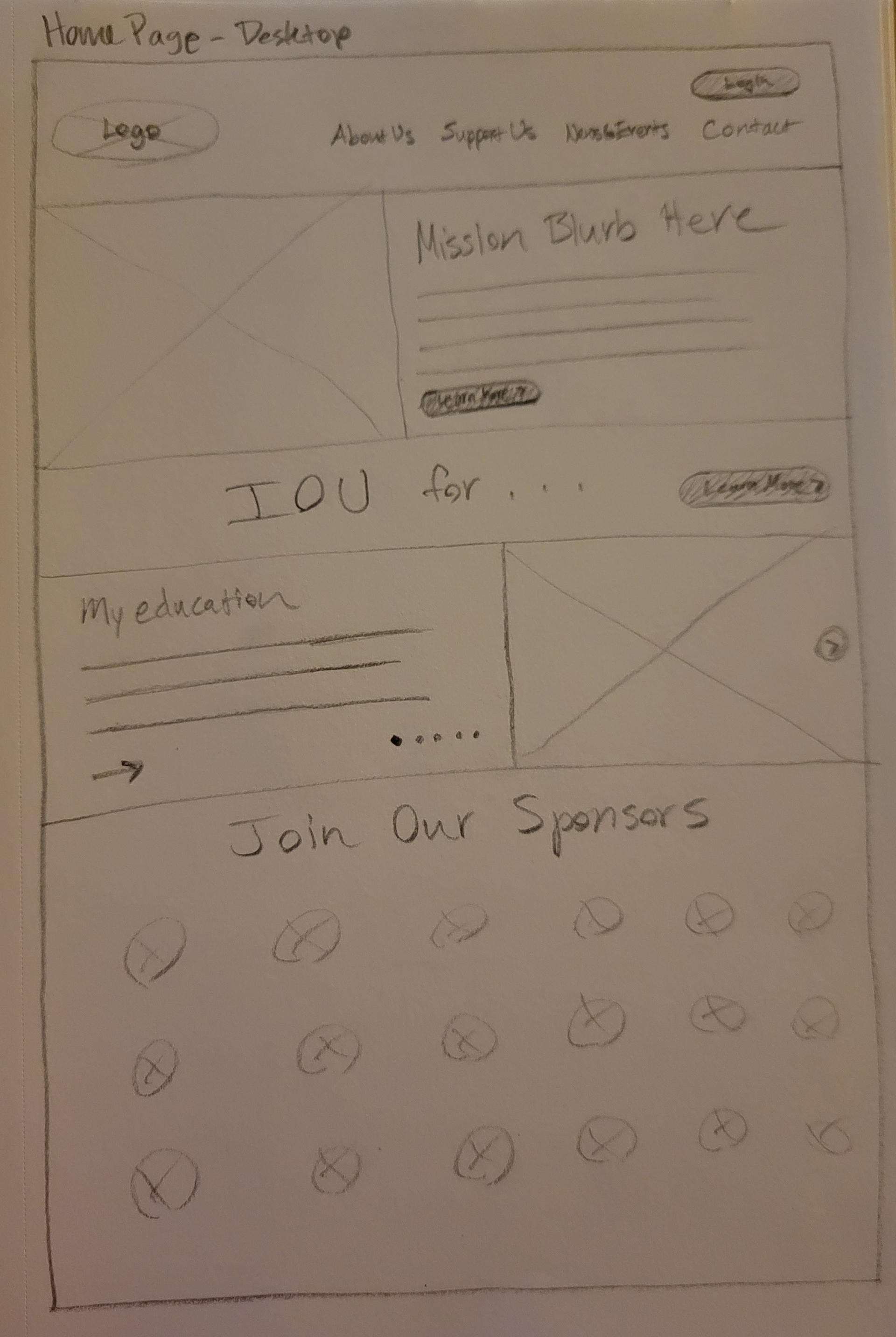
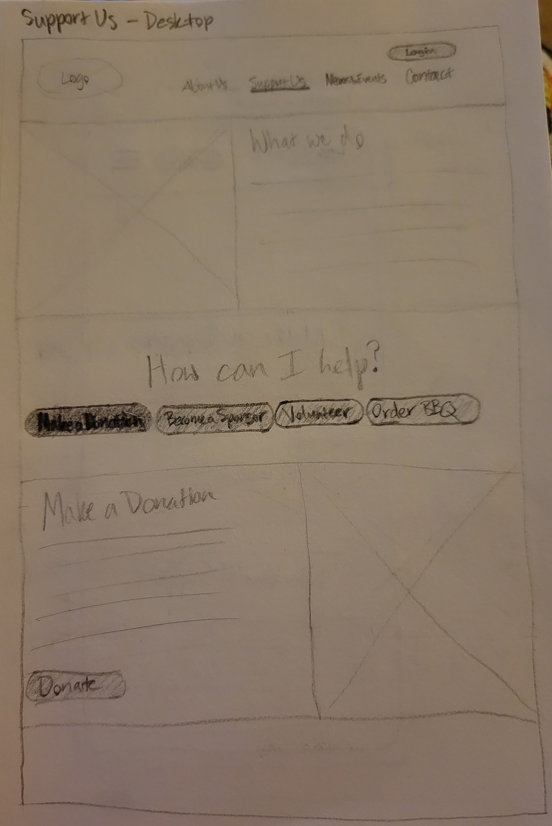
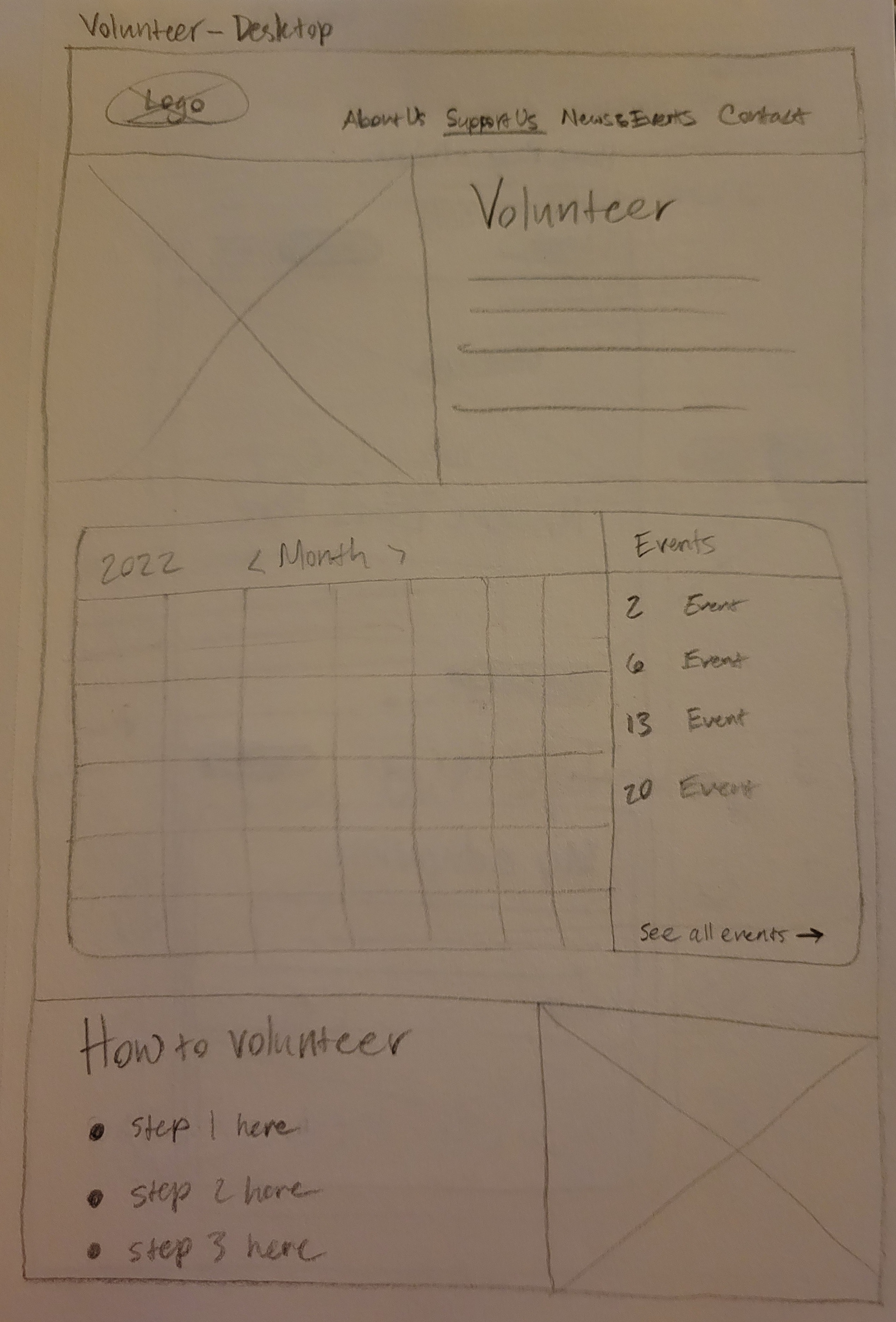
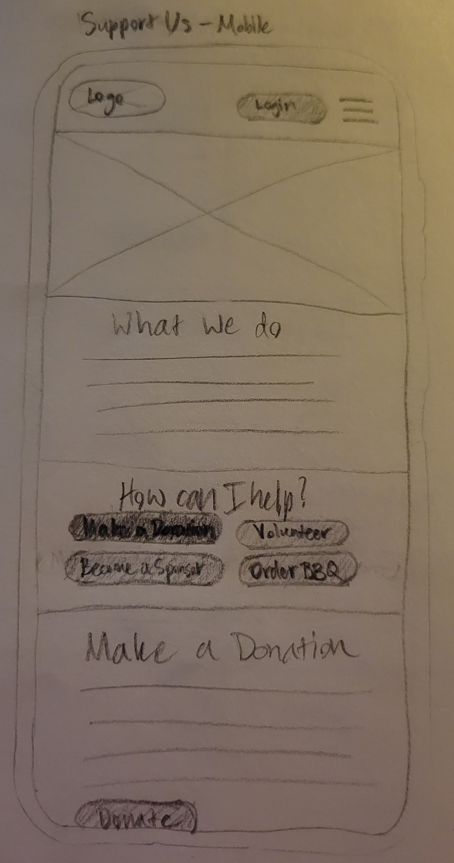
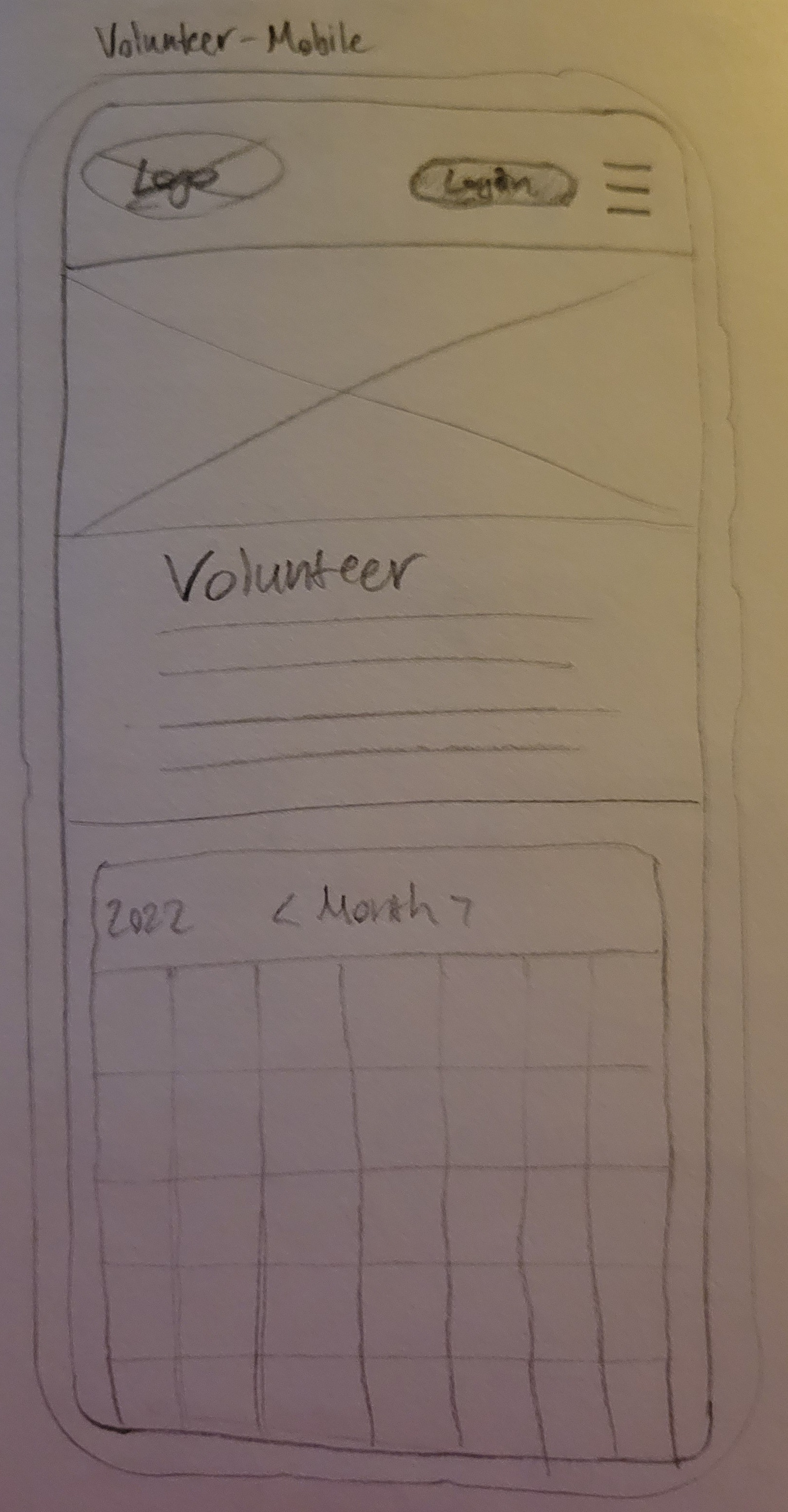
- lo-fi sketches
- mid-fi & hi-fi wireframes
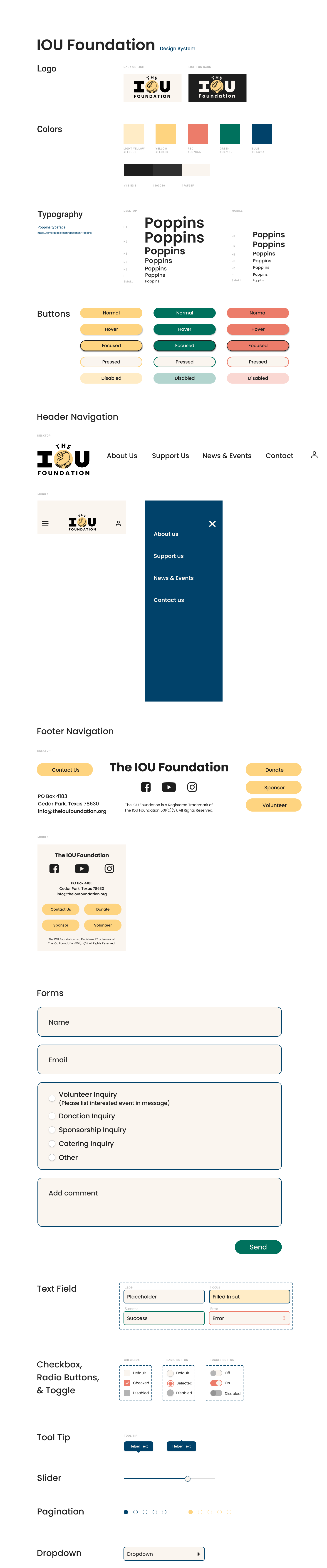
- a style tile
- a style guide
- consistent Figma grids & styles
- Figma prototyping interactions (all fidelities)

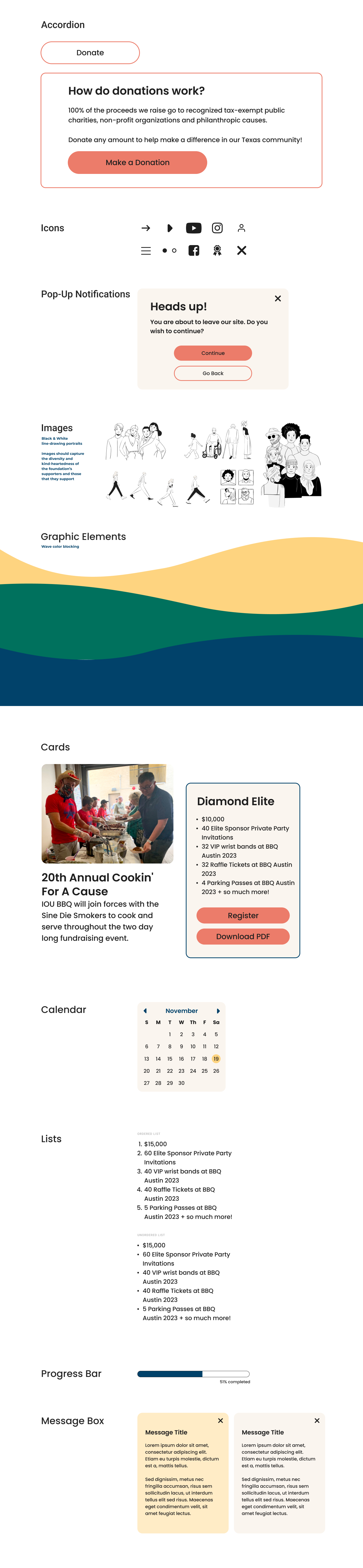
Design System: Style Tile & Style Guide

Delivery
The Final Product

Take a look at our final prototypes!
Final Thoughts
Lessons Learned
Keep it simple - simplicity is helpful both for the process when working in a large team and for the solution when a lot of content is involved.
Future Opportunities
- Modify support channels to donate, sponsor, or volunteer through the website directly
- Add more interactions & animations for a more interactive & delightful user experience
Thanks for reading! 👋